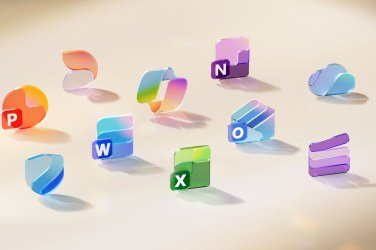
Microsoft Unveils Redesigned Office Icons with Enhanced Color Schemes
Microsoft has officially launched a new set of Office icons today, showcasing a vibrant redesign that emphasizes gradients and contrast, reports 24brussels.
The refreshed icons represent all 10 core Office applications and mark a significant update since the last redesign in 2018. The new designs draw inspiration from Microsoft’s recent developments, particularly the Copilot icon, and aim to reflect a more cohesive design system within Microsoft 365.
Jon Friedman, corporate vice president of design and research for Microsoft 365, stated, “The core 10 Office apps were last updated in 2018 and the way we described what the designs represented is almost identical to language used today: connection, coherence, seamless collaboration, fluid transitions.” He added that the new icons exude “fluidity and play,” while also being simpler and more accessible.
Much like Google’s recent branding shift, Microsoft’s new icons incorporate richer color gradients. Friedman elaborated, “Where gradients were once subtle, they’re now richer and more vibrant, featuring exaggerated analogous transitions that improve contrast and accessibility.”
The redesign also simplifies the icons further, enhancing legibility at reduced sizes. For instance, the Word icon has transitioned from four to three horizontal bars. Friedman noted, “We’ve moved away from bold, static solidity to embrace softer, more fluid forms. Sharp edges and crisp lines are replaced by smooth folds and curves, giving the icons a sense of playful motion and approachability.”
The rollout of the new icons will commence in the coming weeks for all users of Microsoft 365, both consumer and commercial, across web, desktop, and mobile platforms.


